Get complete knowledge of emerging technologies and core concepts of technical topics. This blog is all about Technology and the problem faced by tech companies.
Ever wonder what information you can get from the email of a person? The information that you can get only from the Email address are: Email address owner information Email address owner Country Job profile and associated social media account linked with the Email address You can also get the phone number, permanent address and profile picture of the Email address owner Now you might be thinking HOW? Using Reverse Email Lookup Reverse Email Lookup: Reverse email lookup is the process of finding the identity of an email sender by using their email address. This can be used to confirm the identity of an email sender or to find out more information about them. Use case of Reverse Email Lookup: Scam and Fraud Prevention Verification of Ecommerce Transactions Credit Risks Analysis HR Talent Identification To know more about Reverse Email Lookup check the blog 3 Simple Methods To Do Reverse Email Lookup How to perform Reverse Email Lookup? Here comes Proxycurl ...
Get link
Facebook
X
Pinterest
Email
Other Apps
How to get started with Data Science?
Get link
Facebook
X
Pinterest
Email
Other Apps
In simple terms we can explain Data Science as the collection of data, Understanding data, cleaning the data and
getting information(insight) from the data so that it can be use in improving
business or any other field.
The Data Scientist are analytical experts who utilize their skills to get
insights from the data and use it for the development of an
organization.
Descriptive statistics is a way of analyzing and identifying the basic
features of a data set. Descriptive statistics provide summaries and
descriptions of the data, as well as a way to visualize the data. A lot
of raw information is difficult to review, summarize and communicate.
With descriptive statistics, you can present the data in a meaningful
way.
Important analyses in descriptive statistics include normal distribution (bell curve), central tendency (the mean,
median, and mode), variability (25%, 50%, 75% quartiles), variance, standard
deviation, modality, skewness and kurtosis, according to Towards Data
Science, a data science industry blog.
Descriptive statistics are separate from inferential statistics. Descriptive
statistics show what the data is; inferential statistics are used to reach
conclusions and draw inferences from the data.
Probability theory :
Probability theory is a branch of mathematics that measures the likelihood
of a random event occurring, according to Encyclopedia Britannica. A random
experiment is a physical situation with an outcome that can’t be predicted
until it’s observed. Like flipping a coin. Probability is a quantifiable
number between zero and one that measures the likelihood of a certain event
happening. The higher the probability (the closer to one), the more likely
it is to happen. The probability of flipping a coin is 0.5 since landing on
heads or tails is equally likely.
Probability looks at what might happen based on a large amount of data —
when an experiment is repeated over and over. It doesn’t make any
conclusions regarding what might happen to a specific person or in a
specific situation. Statistical formulas related to probability are used in
many ways, including actuarial charts for insurance companies, the
likelihood of the occurrence of a genetic disease, political polling and
clinical trials, according to Britannica.
The two of the most common programming language used in Data science are:
Python
R
Python :
Python’s increased use in data science applications has situated it
in opposition to R, a programming language and software environment specifically designed
to execute the sorts of data analysis tasks Python can now handle. As
speculation mounts about whether one of the languages will eventually replace the other in the data science sphere, individuals have to decide which
language to learn or which to use for a specific project.
One of the main reasons why Python is widely used in the scientific and
research communities is because of its ease of use and simple syntax which
makes it easy to adapt for people who do not have an engineering background.
It is also more suited for quick prototyping.
According to engineers coming from academia and industry, deep learning
frameworks available with Python APIs, in addition to the scientific
packages have made Python incredibly productive and versatile. There has
been a lot of evolution in deep learning Python frameworks and it’s rapidly
upgrading.
In terms of application areas, ML scientists prefer Python as well. When it
comes to areas like building fraud detection algorithms and network
security, developers leaned towards Java, while for applications like
natural language processing (NLP) and sentiment analysis, developers opted
for Python, because it provides large collection of libraries that help to
solve complex business problem easily, build strong system and data
application.
Following are some useful features of Python language:
It uses the elegant syntax, hence the programs are easier to read.
It is a simple to access language, which makes it easy to achieve the
program working.
The large standard library and community support.
The interactive mode of Python makes its simple to test codes.
In Python, it is also simple to extend the code by appending new modules
that are implemented in other compiled language like C++ or C.
Python is an expressive language which is possible to embed into
applications to offer a programmable interface.
Allows developer to run the code anywhere, including Windows, Mac OS X,
UNIX, and Linux.
It is free software in a couple of categories. It does not cost anything
to use or download Pythons or to add it to the application.
Most Commonly used libraries for data science :
NumPy is fundamental
for scientific computing with Python. It supports large, multi-dimensional arrays and matrices and includes
an assortment of high-level mathematical functions to operate on these
arrays.
SciPyworks with NumPy arrays and provides efficient routines for numerical integration and
optimization.
Matplotlib is
a 2D plotting library that can generate such data visualizations as histograms, power
spectra, bar charts, and scatterplots with just a few lines of code.
Built on NumPy, SciPy, and Matplotlib, Scikit-learn is a machine learning library that implements classification, regression, and clustering
algorithms including support vector machines, logistic regression,
naive Bayes, random forests, and gradient boosting.
The source from where you can learn python is:
R :
R is actually a programming environment and language made specifically
for graphical applications and statistical computations. It is licensed
under the GNU license, just like the S language, which is developed by
Bell Laboratories. It is very similar to the S language, though
implemented in a different manner. Because of this, some programs
written in the S language can also be run in R’s environment, without
much alteration.
The R language is very useful in the field of statistical computation
and data science. It offers various techniques like clustering,
time-series analysis and classification technique, nonlinear/linear
modelling and classical statistical tests. Also, this language is very
adaptable and extensible. Along with these, it supports many graphical
techniques too.
Some background of R:
R is a language and software environment which was made by Robert
Gentleman and Ross Ihaka from the University of Auckland in New Zealand.
It is used in various fields such as for analysis of statistical
information, their graphical representation and their reporting. It is
being further developed by the R Development Core Team. R is free under
the GNU General Public License and its precompiled binary code is
available for download. It also supports many operating systems like
Windows, Linux and MacOS.
The name of this programming language originates from the initials of
the first name of both its creators, which is R. Also, its name can be
considered as a play on the name of the S language, which was created by
the Bell Laboratories.
R was made in the 1990s when programming languages like Redmonk, Tlobe
and PyPL were popular. It is an alternate implementation of the S
language, as already stated. R is an important tool for machine learning
and statistics, along with numerical analysis.
R features for data science applications:
R is a very unique language and has some really interesting features
which aren’t present in other languages. These features are very
important for data science applications. Some of these features are
explained below:
Multiple calculations can be done with vectors
R is a vector language. Unlike other languages, R can do many things at
once. You can add functions to a single vector without putting it in a
loop. This feature of R makes it more powerful and faster than the other
languages.
You can run your code without any compiler
As R is an interpreted language, you can run your code without any
compilers. In other programming languages like Java or C, a compiler is
required to make out the instructions from your code before running it.
However, R directly interprets the code into a full-fledged program.
This makes development of the code easier.
Statistical language
R was designed for statistical studies, and proved excellent in its
field of work. However, as the power of R is being realised, it is
finding use in a variety of other places, starting from financial
studies to genetics and biology and medicine. This is because R is a
Turing-complete language, which means that any task can be programmed in
R.
Data science support
R provides support functions for data science applications. Some of
them are charts, graphs, data interface, statistical functions, etc. All
these functions are specifically used for data science applications and
statistical analysis.
Why R is important for data science professionals?
R is very important in data science because of its versatility in the
field of statistics. R is usually used in the field of data science when
the task requires special analysis of data for standalone or distributed
computing.
R is also perfect for exploration. It can be used in any kind of
analysis work, as it has many tools and is also very extensible.
Additionally, it is a perfect fit for big data solutions.
Following are some of the highlights which show why R is important for
data science:
Data analysis software: R is s data analysis software. It is used by
data scientists for statistical analysis, predictive modeling and
visualization.
Statistical analysis environment: R provides a complete environment for
statistical analysis. It is easy to implement statistical methods in R.
Most of the new research in statistical analysis and modeling is done
using R. So, the new techniques are first available only in R.
Open source: R is open source technology, so it is very easy to
integrate with other applications.
Community support: R has the community support of leading
statisticians, data scientists from different parts of the world and is
growing rapidly.
So, most of the development of R language is done by keeping data
science and statistics in mind. As a result, R is become the default
choice for data science applications and data science
professionals.
The source from where you can learn R:
3. Big Data :
The term “big data” refers to data that is so large, fast or complex that
it’s difficult or impossible to process using traditional methods. The act
of accessing and storing large amounts of information for analytics has
been around a long time. But the concept of big data gained momentum in
the early 2000s when industry analyst Doug Laney articulated the
now-mainstream definition of big data as the three V’s:
Volume: organization collect data from
variety of resources,including business transaction, smart(iot)
devices,industrial equipment,videos,social media.
Velocity: with the growth in the internet of
things, data streams in to businesses at an unprecedented speed and must
be handled in a timely manner.
Variety: data comes in all types of
formats from structured, numeric data in traditional databases to
unstructured text documents,emails,videos,audios,stock ticker data and
financial transactions.
Data visualization:
Data visualization refers to techniques used to communicate insights from
data through visual representation. Its main goal is to distill large
datasets into visual graphics to allow for easy understanding of complex
relationships within the data. It is often used interchangeably with terms
such as information graphics, statistical graphics, and information
visualization.
It is one of the steps of the data science process developed by Joe Blitzstein, which is a framework for approaching data science tasks. After data is
collected, processed, and modeled, the relationships need to be visualized
so a conclusion can be made.
It’s also a component of the broader discipline of data presentation
architecture (DPA), which seeks to identify, locate, manipulate, format, and
present data in the most efficient way.
In the early days, the easiest and most common way to create a data
visualization was to take the information from an Excel spreadsheet and
transform it into a bar graph, pie chart, or table.
This method is still extremely effective, but the art of data
visualization has also come a long way in the past 20+ years.
Nowadays you also have the option to create more intricate
visualizations such as:
Bubble clouds.
Bullet graphs.
Heat maps.
Radial trees.
Infographics.
And more.
Data visualization is the act of taking information (data) and placing
it into a visual context, such as a map or graph.
Data visualizations make big and small data easier for the human brain
to understand, and visualization also makes it easier to detect
patterns, trends, and outliers in groups of data.
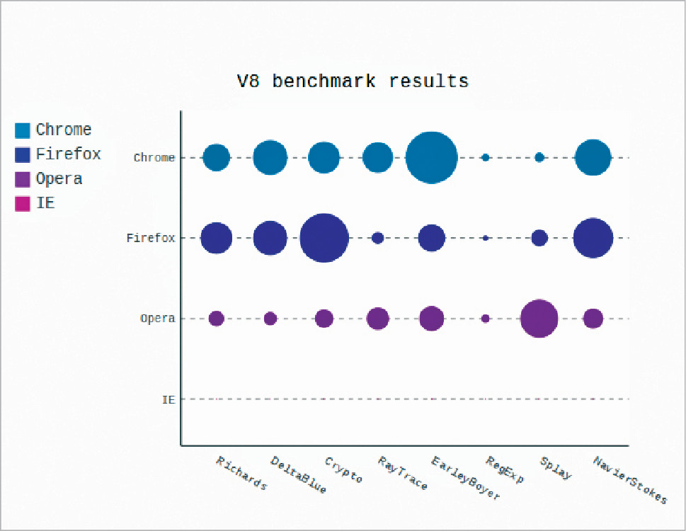
Python libraries for data visualization are:
Matplotlib:
Matplotlib Python Library is used to generate simple yet powerful
visualizations. More than a decade old, it is the most widely-used
library for plotting in the Python community. Matplotlib is used to
plot a wide range of graphs– from histograms to heat plots.
Matplotlob is the first Python data visualization library, therefore
many other libraries are built on top of Matplotlib and are designed
to work in conjunction with the analysis. Libraries like pandas and
matplotlib are “wrappers” over Matplotlib allowing access to a number
of Matplotlib’s methods with less code.
The versatility of Matplotlib can be used to make visualization types
such as:
Scatter plots
Bar charts and Histograms
Line plots
Pie charts
Stem plots
Contour plots
Quiver plots
Spectrograms
You can create grids, labels, legends etc. with ease since everything
is easily customizable.
Seaborn is a popular data visualization library that is built on top
of Matplotlib. Seaborn’s default styles and color palettes are much
more sophisticated than Matplotlib. Seaborn puts visualization at the
core of understanding any data. Seaborn is a higher-level library-
it’s easier to generate certain kinds of plots, including heat maps,
time series, and violin plots.
Ggplot is a Python visualization library based on R’s ggplot2 and
the Grammar of Graphics. You can construct plots using high-level grammar without
worrying about the implementation details. Ggplot operates
differently compared to Matplotlib: it lets users layer components
to create a full plot. For example, the user can start with axes,
and then add points, then a line, a trend line, etc. The Grammar
of Graphics has been hailed as an “intuitive” method for plotting,
however seasoned Matplotlib users might need time to adjust to
this new mindset.
Bokeh, native to Python is also based on The Grammar of
Graphics like ggplot. It also supports streaming, and
real-time data. The unique selling proposition is its ability
to create interactive, web-ready plots, which can easily
output as JSON objects, HTML documents, or interactive web
applications. Bokeh has three interfaces with varying degrees of control to
accommodate different types of users. The topmost level is for
creating charts quickly. It includes methods for creating
common charts such as bar plots, box plots, and histograms.
The middle level allows the user to control the basic building
blocks of each chart (for example, the dots in a scatter plot)
and has the same specificity as Matplotlib. The bottom level
is geared toward developers and software engineers. It has no
pre-set defaults and requires the user to define every element
of the chart.
While Plotly is widely known as an online platform for
data visualization, very few people know that it can be
can be accessed from a Python notebook. Like Bokeh,
Plotly’s strength lies in making interactive plots, and it
offers contour plots, which cannot be found in most libraries.
Pygal, like Plotly and Bokeh, offers interactive
plots that can be embedded in a web browser. The
ability to output charts as SVGs is its prime
differentiator. For work involving smaller datasets,
SVGs will do just fine. However, for charts with
hundreds of thousands of data points, they become
sluggish and have trouble rendering. It’s easy to create a nice-looking chart with just a
few lines of code since each chart type is packaged
into a method and the built-in styles are great.
Altair is a declarative statistical visualization
python library based on Vega-Lite. You only need to mention the links between data
columns to the encoding channels, such as x-axis,
y-axis, color, etc. and the rest of the plotting
details are handled automatically. This makes
Altair simple, friendly and consistent. It is easy
to design effective and beautiful visualizations
with a minimal amount of code using Altair.
Geoplotlib is a toolbox used for plotting
geographical data and map creation. It can be
used to create a variety of map-types, like
choropleths, heatmaps, and dot density
maps. Pyglet (an object-oriented programming
interface) is required to be installed to use
Geoplotlib.
Geoplotlib reduces the complexity of designing
visualizations by providing a set of in-built
tools for the most common tasks such as
density visualization, spatial graphs, and
shape files.
Since most Python data visualization libraries
don’t offer maps, it’s good to have a library
dedicated to them.
The primary It is its easy drag-and-drop functionality
to create visualizations. It is faster
than other BI tools and is highly
intuitive making it a perfect self-service
BI tool. It also offers connectivity to a
huge number of data and big data sources
such as Oracle, Teradata, SAP HANA,
MongoDB, Excel, Text files, JSON, Google
Cloud, SQL, Hadoop, Amazon Redshift etc.
It is not needed to buy connector license
to connect to these data sources. Also,
Tableau is designed for all kinds of users
and does not require any specific skillset
or knowledge to work on it. All types of
users, from all over the enterprise can
easily perform all the data analysis and
visualization capabilities.
Microsoft Power BI offers
connectivity to a wide range of data
sources such as Oracle, IBM, SQL
Server, Salesforce, Google
analytics, Azure DevOps, Excel, text
files, JSON, Zendesk, Mailchimp etc.
In addition to this, integration
with big data sources is also easy
with the help of direct connections
using web services.
Qlikview is one the leading
bi tool. according to the Gartner
Magic Quadrant reports for 2019.
QlikView provides in-memory
storage feature which makes
collecting, integrating and
processing of data very fast.
The reports are generated using
visualization tools and the
relationship between data is
derived automatically by the
QlikView software. In other
words, QlikView is a data
discovery tool that facilitates
the creation of dynamic apps for
data analysis.
QlikView is predominantly a data
discovery tool and so it has some
distinct data visualization
features. Data Discovery is a
user-driven search for patterns
and trends in data sets. It helps
users to understand and see these
patterns by providing visual aids
like graphs, tables, maps etc.
QlikView is also unique because of
its flexibility, in-memory
features and collaborative aids.
Have a look at some sample
QlikView apps using different
kinds of visualizations in them.
Features of QlikView
Unique data discovery and global
search
Interactive visualizations
Collaboration
Absolute control over data
Secure working environment
Flexibility and Integrations
Consistent Reporting
Qlik Sense:
Qlik Sense is also a popular data
analysis and visualization software.
At its core it operates with an
associative QIX engine. This engine
enables the user to link and
associate data from different
sources to carry out analysis. Qlik
Sense serves as a data analytics
platform for a wide range of users
i.e. from non-technical to technical
users.
Qlik Sense focuses more on data
visualization as it has augmented
graphics. However, in QlikView you
can manipulate data in a lot of
technical ways through scripting. If
your motive of using Qlik Sense is
visualizing and analysing data in
the best possible graphics, then you
have made the right choice.
Qlik Sense provides a lot of
flexibility to the users as they can
carry out completely independent
operations with the self-service
visualizations and analysis. Also,
they can be guided by the automated
machine-guided analysis by the
cognitive engine of Qlik Sense. Qlik
Sense uses an Associative Model in
which users are free to explore the
vast and complex data and draw
intuitive insights from it.
Integrating large data files from
multiple sources is possible in Qlik
Sense. The clients can share data
applications and reports on a
centralized hub. Along with this,
they can share secure data models,
export the data stories etc. to
enhance their business.
Have a look at some sample Qlik
Sense apps using different kinds of
visualizations in them.
Features of Qlik Sense
Associative model
Smart visualization and
analytics
Self-service creation
Centralized sharing and
collaboration
Data storytelling and reporting
App Mobility
Data preparation and integration
The QIX engine
Enterprise governance and
scalability
SAP Lumira:
SAP Lumira has also made its place in the list
of top 10 BI tools. According to the Gartner’s Magic Quadrant for Analytics and
Business Intelligence platforms
2019, SAP Lumira is categorized as a visionary BI
tool having great potential. SAP Lumira is a
self-service data visualization and analytics
tool known for its ease-of-use and intuitive
applications. SAP Lumira provides rich and
interactive visualizations such as tables,
graphs, charts, maps, infographs, etc.
There are two editions of SAP Lumira based on
the purpose of use; a Discovery edition and a Designer edition of SAP Lumira. In Discovery
edition, you can create self-service data
visualizations and publish them directly to
the SAP BusinessObjects BI tools. Whereas, in
the Designer edition, you can use these
self-service visualizations to create detailed
analytic applications.
SAP Lumira is a user-friendly tool having a
home screen where all the data sources are
available. Input controls, so that users can
work on the application freely. The
application screen provides a single platform
to create visualizations and applications
using the imported data. Users can access
real-time data such as governed data, Universe
data, cloud data, metadata, data from big data
sources etc.
Have a look at some sample SAP Lumira apps
using different kinds of visualizations in
them.
Features of SAP Lumira
Easy application development for data
visualization using low-level JavaScript
programming.
Template-based guided designing of data
visualization dashboards.
Access to Lumira apps through web and
mobile platforms.
Embedded visualizations and customizable
extensions.
Integrate data from multiple data sources.
Integrate with SAP BusinessObjects BI
tools for analysis.
Create ad-hoc reports and dashboards
Storytelling
Artificial intelligence:
AI, a rather hackneyed tech term that is
used frequently in our popular culture – has
come to be associated only with
futuristic-looking robots and a
machine-dominated world. However, in
reality, Artificial Intelligence is far from
that.Simply put, artificial intelligence aims at
enabling machines to execute reasoning by
replicating human intelligence. Since the
main objective of AI processes is to teach
machines from experience, feeding the right
information and self-correction is crucial.
AI experts rely on deep learning and natural
language processing to help machines
identify patterns and inferences.
Scope of Artificial Intelligence
Automation is easy with AI: AI allows you to automate repetitive,
high volume tasks by setting up reliable
systems that run frequent
applications.
Intelligent Products: AI can turn conventional products
into smart commodities. AI
applications when paired with
conversational platforms, bots and
other smart machines can result in
improved technologies.
Progressive Learning: AI algorithms can train machines to
perform any desired functions. The
algorithms work as predictors and
classifiers.
Analysing Data: Since machines learn from the data we
feed them, analysing and identifying
the right set of data becomes very
important. Neural networking makes it
easier to train machines.
Machine learning:
Machine Learning is a subsection of Artificial
intelligence that devices means by which
systems can automatically learn and improve
from experience. This particular wing of AI
aims at equipping machines with independent
learning techniques so that they don’t have
to be programmed to do so, this is the
difference between AI and Machine
Learning.
Machine learning involves observing and
studying data or experiences to identify
patterns and set up a reasoning system based
on the findings. The various components of
machine learning include:
Supervised machine learning: This model uses historical data to
understand behaviour and formulate future
forecasts. This kind of learning algorithms
analyse any given training data set to draw
inferences which can be applied to output
values. Supervised learning parameters are
crucial in mapping the input-output
pair.
Unsupervised machine
learning: This type of ML algorithm does not use any
classified or labelled parameters. It
focuses on discovering hidden structures
from unlabeled data to help systems infer a
function properly. Algorithms with
unsupervised learning can use both
generative learning models and a
retrieval-based approach.
Semi-supervised machine
learning: This model combines elements of supervised
and unsupervised learning yet isn’t either
of them. It works by using both labelled and
unlabeled data to improve learning accuracy.
Semi-supervised learning can be a
cost-effective solution when labelling data
turns out to be expensive.
Reinforcement machine learning: This kind of learning doesn’t use any
answer key to guide the execution of any
function. The lack of training data results
in learning from experience. The process of
trial and error finally leads to long-term
reward
Big Data is one of the most important technologies of our time. It is used in many different industries.Big data serviceis used in many different industries, including healthcare, the military, and the financial world. It has the potential to solve many different problems. These include security, efficiency, and even predicting the future.
I recently came across your article and have been reading along. I want to express my admiration of your writing skill and ability to make readers read from the beginning to the end. Python Classes in Pune
Get yourself a top-of-the-line industry expert within Data Science by mastering the sophisticated technical and non-technical knowledge by Best Data Science Training in Hyderabad by AI Patasala. Data Science Certification in Hyderabad
Thanks for sharing such an informative Article. It will be beneficial to those who seek information. Continue to share your knowledge through articles like these.
Hello everyone, In this blog, you will find a detailed explanation of creating a High Availability with AWS CLI. Prerequisites: Create an AWS account. Install AWS CLI in Windows. Configure AWS CLI with IAM user. What is AWS CLI? The AWS Command Line Interface (CLI) is a unified tool to manage your AWS services. With just one tool to download and configure, you can control multiple AWS services from the command line and automate them through scripts. The AWS Command Line Interface (AWS CLI) is an open-source tool that enables you to interact with AWS services using commands in your command-line shell. With minimal configuration, the AWS CLI enables you to start running commands that implement functionality equivalent to that provided by the browser-based AWS Management Console from the command prompt in your terminal program What is AWS S3 service? Amazon Simple Storage Service is storage for the Internet. It is designed to make web-scale computing easier for...
Before getting started with the case study of Indian Startups, let us first understand what is cloud computing and AWS? What is Cloud Computing? Cloud computing is the on-demand delivery of IT resources over the Internet. Instead of buying, owning, and maintaining physical data centers and servers, you can access technology services, such as computing power, storage, and databases, on an as-needed basis from a cloud provider like Amazon Web Services (AWS). What is Datacenter? At its simplest, a data center is a physical facility that organizations use to house their critical applications and data. A data center's design is based on a network of computing and storage resources that enable the delivery of shared applications and data. The key components of a data center design include routers, switches, firewalls, storage systems, servers, and application-delivery controllers. What is the server? A server is a computer program or device that provides a service to anothe...


very informative article post. much thanks again
ReplyDeleteData Science Training in Hyderabad
Data Science course in Hyderabad
Data Science coaching in Hyderabad
Data Science Training institute in Hyderabad
Data Science institute in Hyderabad
Very good content.Thanks for sharing
ReplyDeleteData Science Online Training
Thank you 😊
DeleteYou have provided finicky information for a new blogger so it has turned out to be really obliging. Keep up the good work!
ReplyDeleteSAP training in Kolkata
SAP course in Kolkata
SAP training institute in Kolkata
Thanks for sharing. I would also suggest for Data Science course, visit: https://socialprachar.com/data-science/
ReplyDeleteI just loved your article on the beginners guide to starting a blog.If somebody take this blog article seriously in their life,
ReplyDeletehe/she can earn his living by doing blogging.thank you for thizs article.
Machine Learning with Python Online Training ,
Machine Learning with Python Online Training
I just loved your article on the beginners guide to starting a blog.If somebody take this blog article seriously in their life,
ReplyDeletehe/she can earn his living by doing blogging.thank you for thizs article.
Machine Learning with Python Online Training ,
Machine Learning with Python Online Training
ReplyDeleteThis was definitely one of my favorite blogs. Every post published did impress me. ExcelR Data Science Courses
Thanks for Sharing
ReplyDeleteData Science Online Training
Python Online Training
Big Data is one of the most important technologies of our time. It is used in many different industries.Big data serviceis used in many different industries, including healthcare, the military, and the financial world. It has the potential to solve many different problems. These include security, efficiency, and even predicting the future.
ReplyDeleteI am very inspired after reading the article, Thanks! Keep sharing.
ReplyDeleteData Science Training in Pune
I recently came across your article and have been reading along. I want to express my admiration of your writing skill and ability to make readers read from the beginning to the end.
ReplyDeletePython Classes in Pune
This post is so helfull and attractive.keep updating with more information...
ReplyDeleteData Science Course In Mumbai
Data Science Course In Ahmedabad
Data Science Course In Kochi
Data Science Course In Trivandrum
Data Science Course In Kolkata
Get yourself a top-of-the-line industry expert within Data Science by mastering the sophisticated technical and non-technical knowledge by Best Data Science Training in Hyderabad by AI Patasala.
ReplyDeleteData Science Certification in Hyderabad
Thanks for sharing such an informative Article. It will be beneficial to those who seek information. Continue to share your knowledge through articles like these.
ReplyDeleteData Engineering Solutions
Artificial Intelligence Services
Data Analytics Services
Data Modernization Services
It is extremely nice to see the greatest details presented in an easy and understanding manner. data analytics courses pune
ReplyDelete